Select
A styled single-choice field. A listbox, not a <select>.
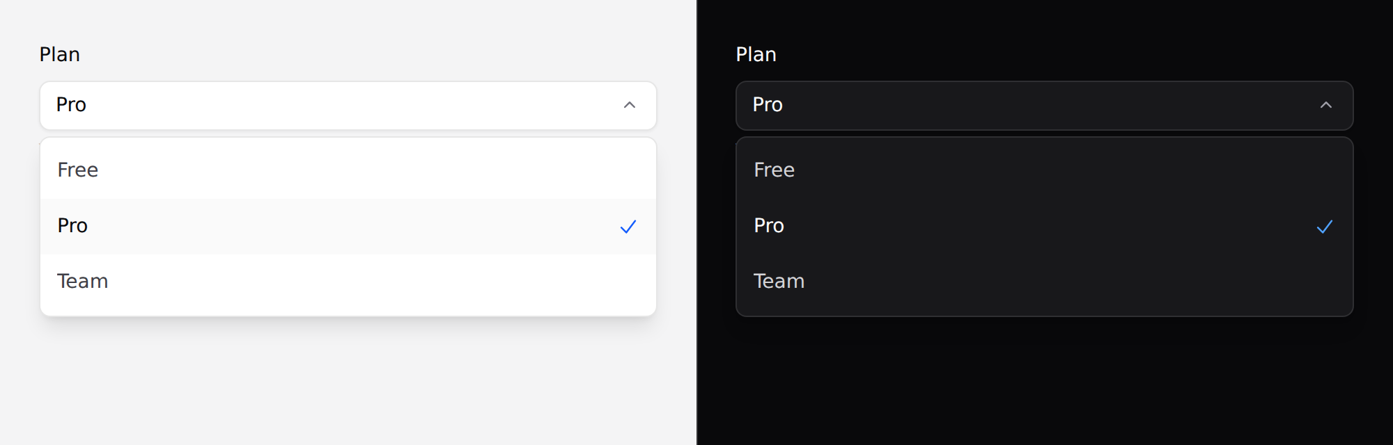
Needs Alpine. See getting started.
Which select
There are two, and the native one is often right:
x-ds::select | x-ds::input as="select" | |
|---|---|---|
| Renders | a listbox you can style | the OS control |
| Needs JS | yes | no |
| On a phone | a popup list | the native wheel or sheet |
| Typeahead | no | yes, free |
Prefer the native one on anything phone-first, and for long or unfamiliar
lists. This exists because the popup of a native <select> cannot be styled
at all.
Use it
<x-ds::select
    name="plan"
    label="Plan"
    :options="['free' => 'Free', 'pro' => 'Pro', 'team' => 'Team']"
    :value="old('plan', $user->plan)"
/>
Props
| Prop | Type | Default | What it does |
|---|---|---|---|
name | string | required | The submitted field name. |
options | array | [] | value => label. |
value | string | — | The selected value. |
label | string | — | Field label. |
placeholder | string | Select… | Shown when nothing is selected. |
help | string | — | Guidance under the field. |
error | string | — | Validation message. |
disabled | bool | false |
options is an array, not slot children, because the trigger has to render
the selected option's label — the component must be able to look a value up.
It posts like a normal field
The value rides in a hidden input, so this submits in a plain form exactly like
a <select>:
<form method="POST" action="/settings">
    @csrf
    <x-ds::select name="plan" label="Plan" :options="$plans" :value="old('plan', $user->plan)" />
    <x-ds::button type="submit">Save</x-ds::button>
</form>
With Livewire, bind the same way you would any field:
<x-ds::select name="plan" wire:model.live="plan" :options="$plans" :value="$plan" />
Keyboard
Everything a select should do: ArrowDown opens it, arrows move, Home and End jump, Enter and Space choose, Escape closes, Tab closes and moves on.
Focus enters the selected option, not the first — opening a list of forty countries at the top when "Zambia" is chosen loses the reader's place.
Accessibility
- The trigger is a
comboboxwith a livearia-expanded; the list is alistboxand the options areoptions witharia-selected. errorsetsaria-invalidand wiresaria-describedby.- The selected option shows a tick as well as a weight change — weight alone is not reliable when comparing two rows.
- It renders its selected state from PHP, so there is no flash of the wrong option before Alpine boots.
Don't
- Don't use it for actions. A menu of verbs is a dropdown.
- Don't put more than about fifteen options in it. There is no typeahead and no search.
- Don't omit
name. The hidden input is the only reason this submits. - Don't reach for it on a phone-first screen. See the top of this page.
More in specs/select.md.
From the package repo: edit this page on GitHub.