Toast
A brief report that something already happened. Covers toast and
toast-region.
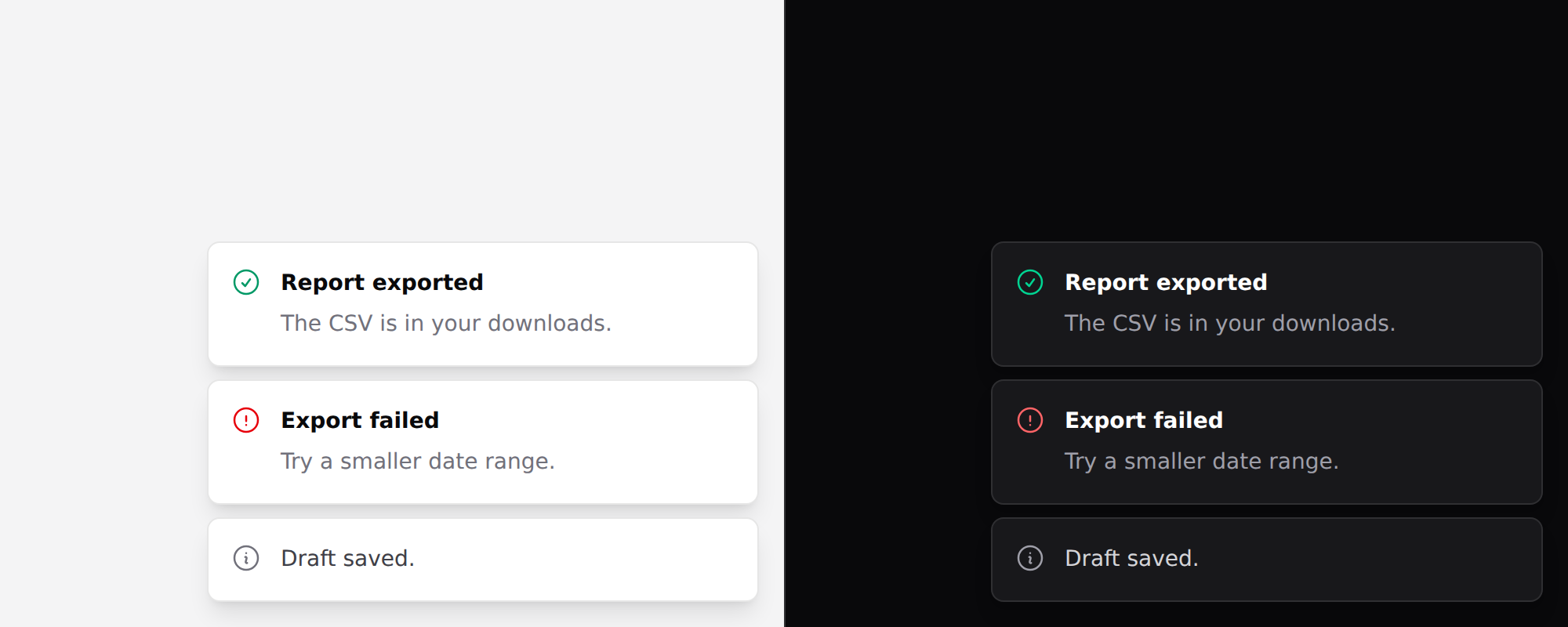
dismissis the one prop here that needs Alpine — it takes an expression that removes the toast. Everything else works in a plain Blade view.
Put the region in your layout, once
{{-- resources/views/layouts/app.blade.php --}}
<x-ds::toast-region position="bottom-right" />
Always rendered, and empty most of the time. A live region only announces content that arrives after it is in the document — render the region together with the first toast and the first toast is silent, which is the one a reader most needs to hear.
Then add toasts
<x-ds::toast-region position="bottom-right">
    @foreach ($toasts as $toast)
        <x-ds::toast :tone="$toast->tone" :title="$toast->title" dismiss="…">
            {{ $toast->body }}
        </x-ds::toast>
    @endforeach
</x-ds::toast-region>
toast-region props
| Prop | Type | Default | What it does |
|---|---|---|---|
position | bottom-right top-right bottom-center top-center | bottom-right | |
label | string | Notifications | The region's name in a landmark list. |
toast props
| Prop | Type | Default | What it does |
|---|---|---|---|
tone | neutral accent success warning danger | neutral | Lives in the icon. Resolved on the server — see below. |
title | string | — | Bold first line. |
icon | string | tone's default | |
dismiss | Alpine expression | — | Renders a close control that runs this. |
Plus an action slot.
A dynamic list of toasts
A toast list is inherently dynamic, which makes this the component where the limitation below bites hardest and is most natural to walk into.
toneresolves to classes on the server. They are chosen when the view renders, so binding it to Alpine state does nothing. See Driving components from client-side state.
{{-- Renders every toast neutral, whatever item.tone says --}}
<template x-for="item in toasts" :key="item.id">
    <x-ds::toast ::tone="item.tone" ::title="item.title" />
</template>
::tone sets a tone attribute on the rendered element. Nothing reads it — the
icon and its colour were decided before the browser saw the markup.
If the toasts come from the server, which is the common case, nothing is
wrong: render the region in the response, or from a Livewire component, and each
toast gets its tone the ordinary way. That is the @foreach at the top of this
page.
If the list lives only in the browser, use one <template x-for> per tone
over a filtered list:
<x-ds::toast-region position="bottom-right">
    @foreach (['success', 'danger', 'warning', 'neutral'] as $tone)
        <template x-for="item in toasts.filter(t => t.tone === '{{ $tone }}')" :key="item.id">
            <x-ds::toast tone="{{ $tone }}" ::title="item.title"
                dismiss="toasts = toasts.filter(t => t.id !== item.id)" />
        </template>
    @endforeach
</x-ds::toast-region>
That is correct and it has a real cost: toasts group by tone rather than by arrival order. Four successes and one failure show the failure in tone order, not last. If arrival order matters more than tone — and for a failure it usually does — render the region from the server instead.
Why tone is not a data attribute
The obvious fix is to make the toast take data-tone and drive the icon colour
from CSS, so a single x-for would work. It has not been done, and the reason is
worth writing down rather than rediscovering:
- The tone does not only pick a colour. It picks the icon —
check-circlefor success,exclamation-trianglefor warning — and an icon is markup that CSS cannot swap. A data-attribute toast would still need a bound:nameon the icon, so it would solve half the problem and add a second styling mechanism to the system for it. - It would be the only component styled that way.
badge,alertandsheet-itemhave the same shape, and one exception that behaves differently from its three siblings is worse than a limitation all four share. - CSS driven from a data attribute is invisible to Tailwind's scanner in exactly the way this system spends most of its effort avoiding.
If a tone-per-item toast becomes the common case rather than the occasional one,
the honest answer is a toast-list component that takes an array and renders it
server-side — not a second way to style one toast.
Toast or alert
Anything the reader must act on is not a toast. It is on screen for a few seconds, somewhere their eyes are not, and on a phone it may be under a thumb.
A failure that needs a retry belongs in an alert next to the thing that failed.
Timing is yours
The component holds no state and no timer. What to aim for:
- ~5 seconds for a plain confirmation.
- Longer, or never, when the toast has an action. "Undo" on a 3-second timer is a button that is gone before the reader finished reading the sentence offering it.
- Pause on hover and on focus, or someone moving to click Undo watches it disappear under the pointer.
Accessibility
The region is aria-live="polite" — never assertive. A toast reports something
that already happened, and interrupting someone to say a thing they just did
worked is exactly the rudeness polite exists to avoid.
Don't
- Don't stack more than about three. Four is a log, and a log belongs on a page.
- Don't put a form in one. It can vanish mid-typing.
- Don't use one for a validation error. The field needs the message.
- Don't put the only copy of an "Undo" behind a timer.
More in specs/toast.md.
From the package repo: edit this page on GitHub.